

Stop wasting time on messy data. Learn how to build a high-impact CRM dashboard that motivates your sales team and drives real revenue growth today.
Table of Contents
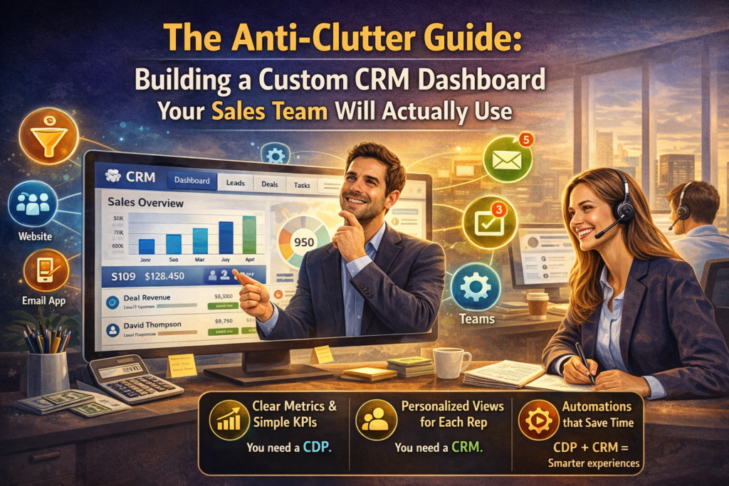
I’ve spent way too much of my life looking at screens that feel like the cockpit of a 747. You know the ones—dozens of flashing red numbers, tiny line graphs that don’t seem to lead anywhere, and so many widgets that you can’t actually find your own email address. For most sales reps, the default CRM dashboard is something they check once a week because their manager told them to, not because it actually helps them close a deal. It’s digital wallpaper.
The reality is that a bad data display isn’t just an eyesore; it’s a productivity killer. When your reps are hunting for information instead of talking to prospects, you’re losing money. If you want to build a CRM dashboard that your team will actually keep open on their second monitor all day, you have to stop thinking like a data scientist and start thinking like a salesperson. You need clarity, speed, and a very short list of things that actually matter.
The Problem With “Everything All At Once”
The biggest mistake I see when companies customize their setup is the “more is better” fallacy. We think that because the software can track 400 metrics, we should show 400 metrics. This leads to what I call “data paralysis.” If a rep opens their CRM dashboard and sees a sea of red and green bars, their brain just shuts down.
A high-performance sales tool should act as a compass, not a map. It should tell you exactly where to go next, not show you every single road in the state. To get there, you have to ruthlessly prune your user interface. If a metric doesn’t help a rep decide who to call in the next ten minutes, it probably doesn’t belong on their main screen.
Identify the High-Value Sales Signals
Before you drag a single chart onto your layout, sit down with your top performers. Ask them: “What is the one piece of info that makes you pick up the phone?” Usually, it isn’t “Total Pipeline Value.” It’s “Leads who opened my proposal in the last hour” or “Clients who haven’t been touched in 30 days.”
When you design your CRM dashboard, you are essentially building a prioritization engine. You want to highlight the “hot” signals while burying the “cold” noise.
- The “Needs Action” List: This should be front and center. It’s the list of tasks, overdue follow-ups, and new leads.
- The Revenue Reality: A simple progress bar toward their monthly quota. It’s the ultimate motivator.
- The Activity Tracker: Not for micromanagement, but for personal accountability. “How many calls have I made today?”
Designing for Human Psychology
We are visual creatures. A wall of text is a chore; a clean graph is a story. Use color sparingly but intentionally in your CRM dashboard design. Red shouldn’t just mean “low number”; it should mean “urgent attention required.”
Avoid the temptation to use complex scatter plots or multi-layered pie charts. If a rep has to squint to understand what a graph is saying, the graph has failed. Stick to simple bar charts for comparisons and big, bold numbers for totals. The goal of a CRM dashboard is to provide an “at-a-glance” status update, not a deep-dive research session.
Mobile Accessibility: The Porch-Side Check
We live in a world where sales happen in coffee shops, airport terminals, and home offices. If your custom CRM dashboard only looks good on a 27-inch iMac, it’s only half-useful. Your team needs to be able to see their most important stats while they are on the move.
Ensure that your layout is responsive. The “Mobile View” should be an even further distilled version of the desktop. Focus on the “Today” view—appointments, urgent calls, and new lead notifications. A rep waiting for a meeting should be able to glance at their CRM dashboard and feel prepared in under five seconds.
Gamification Without the Gimmicks
I’m a big fan of healthy competition, but I’ve seen leaderboard widgets go horribly wrong. If you only show the person in first place, the people in 10th through 20th place will just stop looking. Instead of a standard leaderboard, try showing “Most Improved” or “Highest Activity for the Week.”
A great CRM dashboard should make the user feel like they are playing a game they can actually win. Use visual rewards for hitting milestones. It sounds silly, but a green checkmark or a small “Success” toast notification can provide the hit of dopamine needed to make that 50th cold call of the day.
Integrating External Data Sources
Your CRM shouldn’t be a silo. To make the CRM dashboard truly indispensable, pull in data that sales reps usually have to go elsewhere to find. If you can show a lead’s latest LinkedIn post or their company’s recent funding news directly on the dashboard, you’ve saved the rep three clicks and five minutes of googling.
According to the insights on Sales Force Effectiveness, the less time spent on “non-selling activities,” the higher the revenue per rep. By making your CRM dashboard a one-stop-shop for prep work, you are directly impacting the bottom line. You want your team to feel like they are missing out if they don’t have the dashboard open.
The “One-Click” Rule for Navigation
Every chart on your CRM dashboard should be interactive. If a rep sees a bar representing “5 Leads in Negotiation,” they should be able to click that bar and go straight to those five records. Nothing kills the user experience faster than seeing an interesting data point and then having to manually search for the records behind it.
Think of the dashboard as the “Main Menu” of a video game. It shows you the stats, but it also gives you the “Start” button for every mission. When you build this level of workflow automation into the interface, the CRM stops being a database and starts being a co-pilot.
Training and Iteration: The Job is Never Done
I’ve never seen a “Version 1.0” of a CRM dashboard that stayed that way for long. Your market changes, your sales process evolves, and your team’s needs will shift. Every quarter, do a “Keep, Kill, Change” session with your reps.
- Keep: The widgets they check every morning.
- Kill: The charts that everyone ignores (and we all know which ones they are).
- Change: The metrics that are almost useful but need a different filter or display.
By involving the team in the evolution of the CRM dashboard, you create a sense of ownership. They don’t use it because “the company bought it”; they use it because they helped build it. For more on the technical side of how data visualization impacts business decisions, check out the resources at Tableau’s Learning Center.
Avoiding the “Manager View” Trap
This is the most common reason sales teams hate their CRM. Managers often build the dashboard to show them how the team is doing, rather than building it to help the reps do better. These are two completely different things.
Your manager needs a “Manager View” with bird’s-eye stats and forecasting. Your reps need an “Execution View” with ground-level tasks and individual goals. Don’t force them to use the same CRM dashboard. Give your reps the tools they need to win the daily battles, and the manager’s view will take care of itself.
Data Hygiene: Garbage In, Garbage Out
You can have the most beautiful CRM dashboard in the world, but if the data behind it is six months old, it’s worthless. The dashboard should actually encourage data hygiene. If a rep sees a big “Incomplete Records” widget staring them in the face, they are much more likely to clean it up.
Use the dashboard to highlight what’s missing. When the data is clean, the forecasts are accurate, the reports are useful, and the CRM dashboard becomes a trusted tool rather than a source of frustration. It’s a virtuous cycle that starts with a clear, honest display of the facts.
FAQ Section
1. How many widgets should I have on my CRM dashboard? The sweet spot is usually between 6 and 9. Anything more than that and you start to hit cognitive overload. If you find you need more, consider creating secondary tabs for different parts of the day (e.g., a “Morning Prospecting” tab and an “Afternoon Follow-up” tab).
2. Should every sales rep see the same dashboard? Not necessarily. Your SDRs (Sales Development Reps) who focus on cold outreach need different metrics than your Account Executives who are closing deals. A custom CRM dashboard should be tailored to the specific role and goals of the user.
3. Can I build a dashboard without being a developer? Yes! Most modern CRMs have drag-and-drop builders. The challenge isn’t the technical part; it’s the strategic part. Knowing what to show is much harder than knowing how to show it.
4. How do I know if my sales team is actually using the dashboard? Most CRM platforms provide usage analytics. Look at the “Login Frequency” and “Time on Page” for the dashboard. But the best way to know is to just look over their shoulder—if the CRM dashboard is open while they are making calls, you’ve won.
5. What is the most important metric for a sales rep’s screen? It varies by company, but usually, it’s “Velocity.” How fast are leads moving from one stage to the next? If you can visualize the “bottlenecks” on your CRM dashboard, you give your reps the power to fix their own sales process.
Conclusion
Building a great CRM dashboard is an exercise in empathy. You have to step out of the C-suite and sit in the salesperson’s chair. You have to understand their frustrations, their motivations, and the tiny friction points that slow them down.